Aperture seems to have a pretty good set of defaults in the main – it certainly doesn’t get in my way for simple things, but recently I’d been getting upset with the performance of the EOS 350D kit lens (Canon EF-S 18-55mm) where my images just simply looked poorer than I expected. Until recently I’d not been able to use Adobe’s raw convertor, but after a terrible shot of a climbing wall I was really annoyed and on a whim tried the image in PSE3 as well as Aperture.
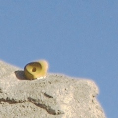
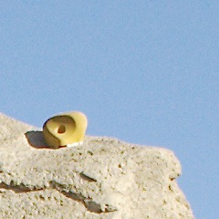
The difference was night and day: the lens isn’t great, but the image was certainly acceptable and nowhere near as poor as I’d first thought, so I started going through all of the Aperture options in more detail. It turns out that the default 350D raw conversion settings have a chroma blur of 2.00 applied, and whilst this gives a gorgeous blend for the blue tones in the sky, it exacerbates any chromatic aberration that might be present. Take a look at the following 100% crop examples:
Just in case you couldn’t guess, the first image has a chroma blur of 2, and on the second it has been turned off completely. The yellow hold is now bearable in terms of sharpness considering the lens, and the wall itself has much more edge detail, but looking closely at the sky shows that the lack of blur can be a bad thing too…
For this image, I found that chroma blur of 0.43 gave an acceptable result for viewing on screen, but this is more of a warning that the default settings are not perfect, so do bear this in mind when shooting anything that may contain a high contrast edge. Adding a blur/sharpen slider to the colour editing tool would be a great compromise, but the answer is that region selections would make this problem vanish.
Here’s hoping for an updated colour tool in 1.6, or region selection in 2.0…


Duncan MacGregor
I’m not sure if it’s a demosaicing issue or chromatic aberration but have a look at the detail in the rock on the unflitered version (most notable in the transitions from light to shade)—there’s something very wrong in there. Fancy sticking up the version with the toned down chroma blur?